It is not rare to find braille on money. Some coins and paper currencies contain braille writing. Braille is more often associated with paper money, but there are a few examples of braille on coins. There are two primary reasons to put braille on money: to bring awareness to people with visual impairment, or to make it easier to recognize currency.
Braille on coins
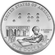
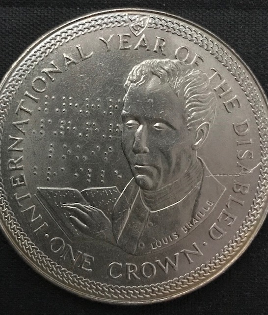
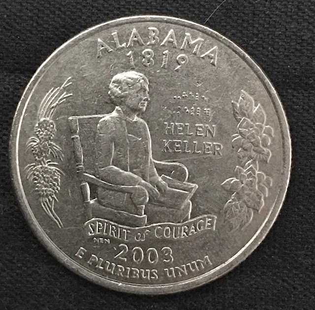
The first coin with braille was the 1 Crown from the Isle of Man commemorating the International Year of Disabled persons. Since then more than a hundred coins were minted with braille.
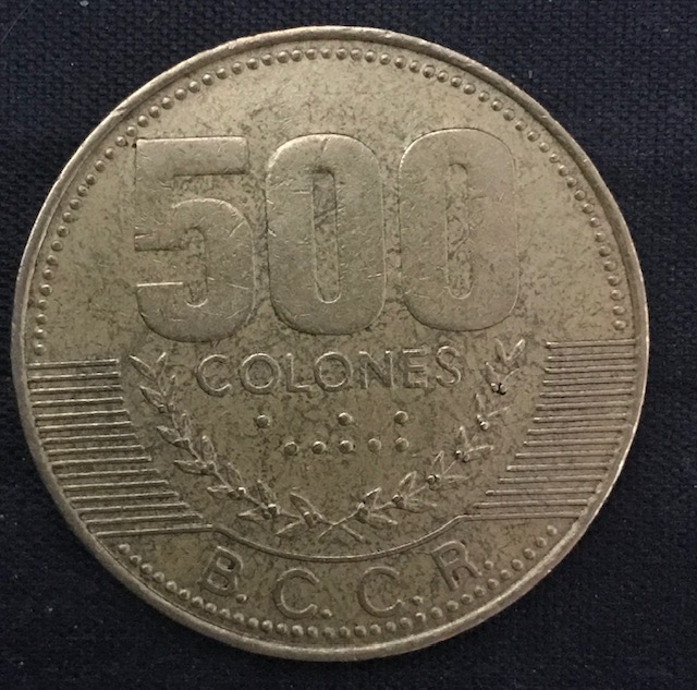
Since the size of braille is relatively large, it is hard to create proper braille letters on coins, thus most braille on coins is much smaller. For example the 500 Colones from Costa Rica. The intent of braille is not necessarily to help blind people to recognize coins. Coins should be recognizable by other means, for example tactile design, different size of coins, different shapes or edges, etc. Currently five countries have braille on coins which are still in circulation: Belgium, Costa Rica, Italy, Peru and the United States. At the time of this writing, no countries are minting circulating coins with Braille. The last ones were from Costa Rica in 2016.
Tactile braille on coins
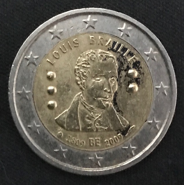
There are a couple of circulating coins out there today the Belgian 2 Euro, and the Italian 2 Euro coins which were only minted in 2009 as a commemorative for the 200th year of Louis Braille’s birth. Both of these coins have the braille “LB”, the initials of Louis Braille.
Braille on banknotes
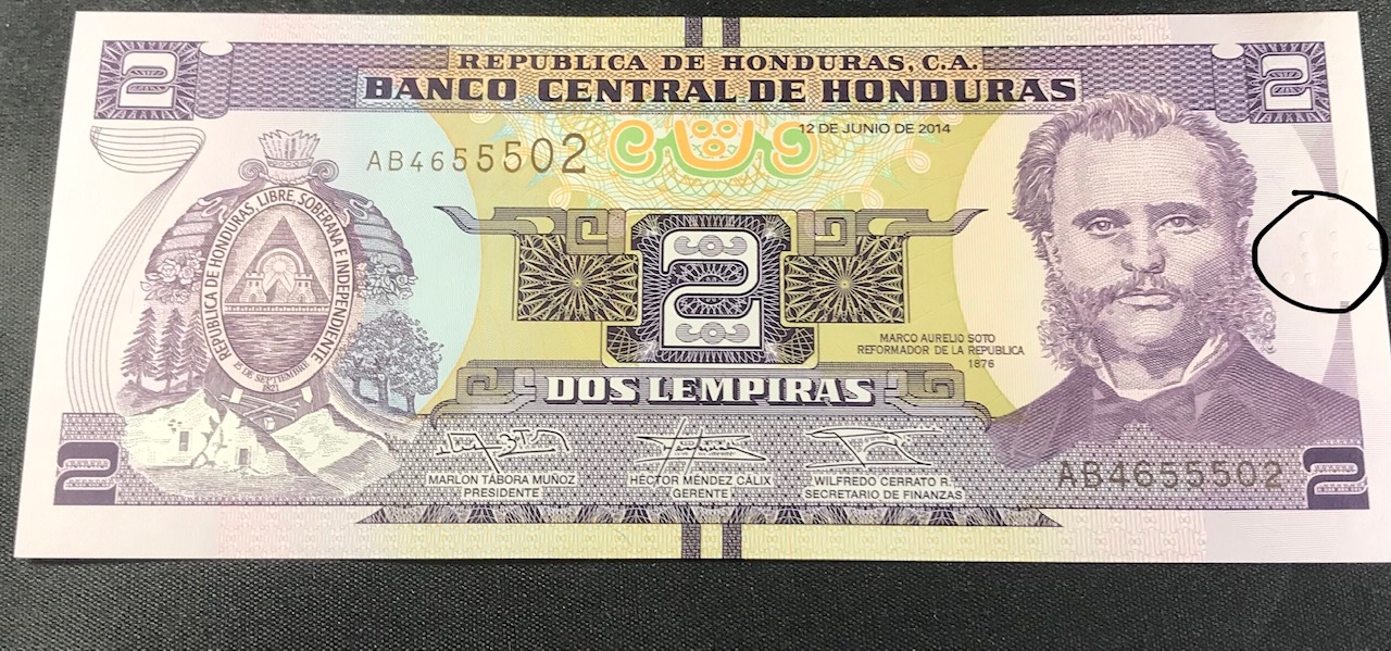
Braille has a more practical use on banknotes. Banknotes in general are much harder to differentiate for blind people, thus some countries implemented braille features to help blind people. A few examples would be Canada which uses braille dots and not braille numbers, Australia also using braille dots, Honduras using actual braille numbers.
Other tactile features of banknotes
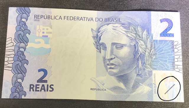
Other banknotes, for example the Brazilian Real or the Bahraini Dinar use tactile lines to help visually impaired people differentiate banknotes.
Should there be braille on money?
It is not too practical to put braille on coins. Braille is too large so it would take up most of the coin’s surface. Besides, other features should be sufficient to identify coins.
Banknotes could theoretically benefit from braille, but there is another problem: many blind people do not read braille. According to the National Braille Press, for example, in the United States only 12 percent of school-age children learn braille. Therefore, it is not the actual braille numbers which will be important, but more the tactile features, let these be braille dots, lines or shapes. When someone does not read braille, it can actually be harder to tell the different denominations apart. For example, the #2 and #5 have the same amount of dots, or the difference between the #10 and #50 is only one dot. Especially when the note is more worn, it can be more confusing than helpful. There is also other ways of making paper currency more accessible, for example using different currency width and length.


Lovely detailed post, Tom. Thanks.
Thank you. Forgot to mention that since I really wanted to make sure what I’m trying to show are visible, my daughter helped me with the pictures.
Thank you for all of these illustrative examples, it is interesting to see how this works in other places in the world.
Thanks for reading. And imagine, this is just the tip of the iceberg. Braille on money is such a diverse topic, I am glad that more and more countries are putting braille on their currency.
Great post Tom, and well done to your daughter for the excellent pictures!
Thanks, I’ll let her know. The hardest part was to show the braille and tactile marks in a way that gets the point across.
hi do hong kong coins have braille on them
No, I’m not aware of any.