I found the ultimate coin store, just perfect for blind collectors, too. It is called the Stamp and Coin Place. They are located in Washington State, but they sell online. It started when they mentioned my blog in one of their blog posts on Past and Present. So as it usually happens on twitter, I tweeted the post and thanked them for the mention, after which I got a complement about my blog. There the conversation started with Elizabeth, who appeared to have read my blog and understood my challenges as a blind collector. Fast forward, I have made my first purchase from them, but let’s see why.
But before we get into the story, let’s see why I generally don’t buy much from coin stores, especially not online, then I’ll tell you what changed my mind.
I don’t mind ordering from EBay in the value of a few cents or few bucks. The worst that can happen is that I don’t care much for the coin, it still fills a whole in the list of still missing coins. But when I would like something more specific, it tends to cost more. I have no idea what it looks like, what it feels like, and I’m better off buying a lottery ticket. I’m not saying that a coin may not be nice, but it may not mean a lot to me. For example, I can easily spend hundreds on a beautiful old silver coin that is visually appealing, but there’s not much to feel on it. For that matter, I won’t even be able to tell it apart from some of my other worn coins. In this case, there’s no value in it for me. So, the best thing for me is to go to an actual store or a coin show and touch the coins before I buy them. Ok, it has other issues, but when it comes to lower cost coins, they usually don’t mind if I touch the coin before buying.
When I started talking with Elizabeth, she told me she should be able to send me a list of coin descriptions if I tell her what interests me. She did, indeed, send me a list of about 20 coins in a few days. It is important to note at this point that I did tell her prior to getting the coin list that I usually go for more cheaper coins which provide a nice tactile experience than high priced collectors’ items, and I’m working with a budget, so I am not going to be their most profitable client, before she spends too much time on me.
But this is how business is done at nice places. She put so much effort into the list of descriptions as if I was their one and only client. The descriptions were really great, partly retrieved from coin catalogs, partly personal explanations, also including guidance on what the coins would feel like, and if it would make sense for me to get them, why, or why not.
I’m not going to talk about all of the descriptions I have received, only the ones I actually got to order. But just for your information, they have much more, head over to their site and see it for yourself.
What follows is the list of the five coins I ended up buying, together with the description I received from Elizabeth, the reason why I chose the coin, and what I actually received and why I liked it.
Hard Times Token
Let’s start with the Hard Times Token. I read about them over the last years, the first time I touched one was last year at the World’s Fair of Money, and I just knew I had to get one. But they can be pretty expensive, and some are quite worn. So, I asked if there is one that is a reasonable priced one but still enough to feel on it to enjoy. I felt it was a pretty unreasonable request, but never hurts to ask. Elizabeth got back to me in a day, and sent the following description:
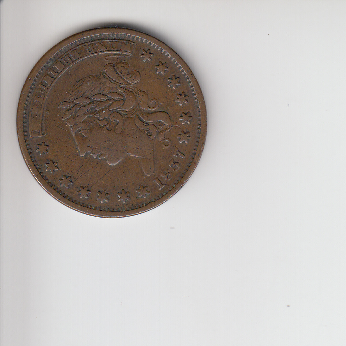
It’s an 1837 token for the Centre Market 14th Ward New York. The reverse shows a building with columns, and the words “14th WARD N.YORK.” The inscription reads “CENTRE MARKET ACCOMMODATION.” It’s definitely seen some wear, but the words are still pretty clear; the design of the building seems to have seen the most wear.
Very fair, I knew I wasn’t going to get a collectors dream, but I wasn’t going to pay for it anyway, and the price was such that for the amount I’m very happy to own a Hard Times Token. But to be honest, the quality is much nicer than what I expected.
Kenya 5 Shillings
The next one was a 5 Shilling from Kenya. If there’s a coin from Kenya and I don’t have it, I just need to have it. There was no better reason for getting this one. The description was:
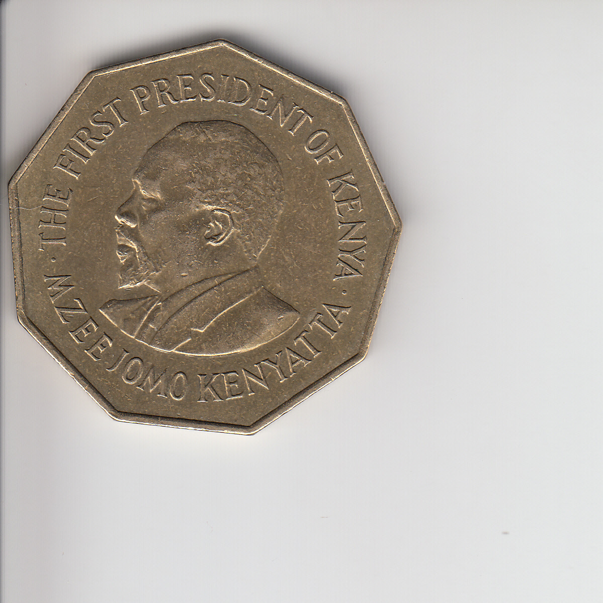
1973 Kenya brass 5 shillings. 9-sided coin. Obverse: Slightly raised rim. Bearded man’s bust facing left. Inscription around rim: “THE FIRST PRESIDENT OF KENYA.MZEE JOMO KENYATTA.” Reverse: Two rampant lions flanking an African shield, holding knives. The design on the shield is a rooster holding an ax. Below the shield is a banner reading “HARAMBEE.” The inscription reads “TEN YEARS OF FREEDOM FIVE SHILLINGS.” The numbers 19 and 73 appear on either side of the lions. Shallow design, but clear. Thought the 9 sides might be interesting.
Yes, I had no idea that it was 9 sided, so it was great information. Ok, I could have found it in a catalog if I really wanted to. But this is exactly the kind of information I need. This certainly makes the coin unique. Also, it is true that the design is shallow, and it is great information to decide if I want it. If it was another coin, maybe I would have skipped it, but since it is from Kenya, it didn’t matter. However, this was a collector’s dream. Very nice, I can’t feel any scratches, the head is very detailed, which is quite important especially when it comes to used coins, sometimes those details wear off first. Probably this was my favorite out of the five coins.
Togo 1 Franc
The next was a 1 Franc from Togo. Again, shallow design, so it was helpful to understand that despite of it the design is clear, otherwise, I would have skipped this one, since an almost 100 year old coin can be quite worn and with an originally shallow design it may not be too enjoyable. I also picked it because I didn’t have a coin from Togo yet.
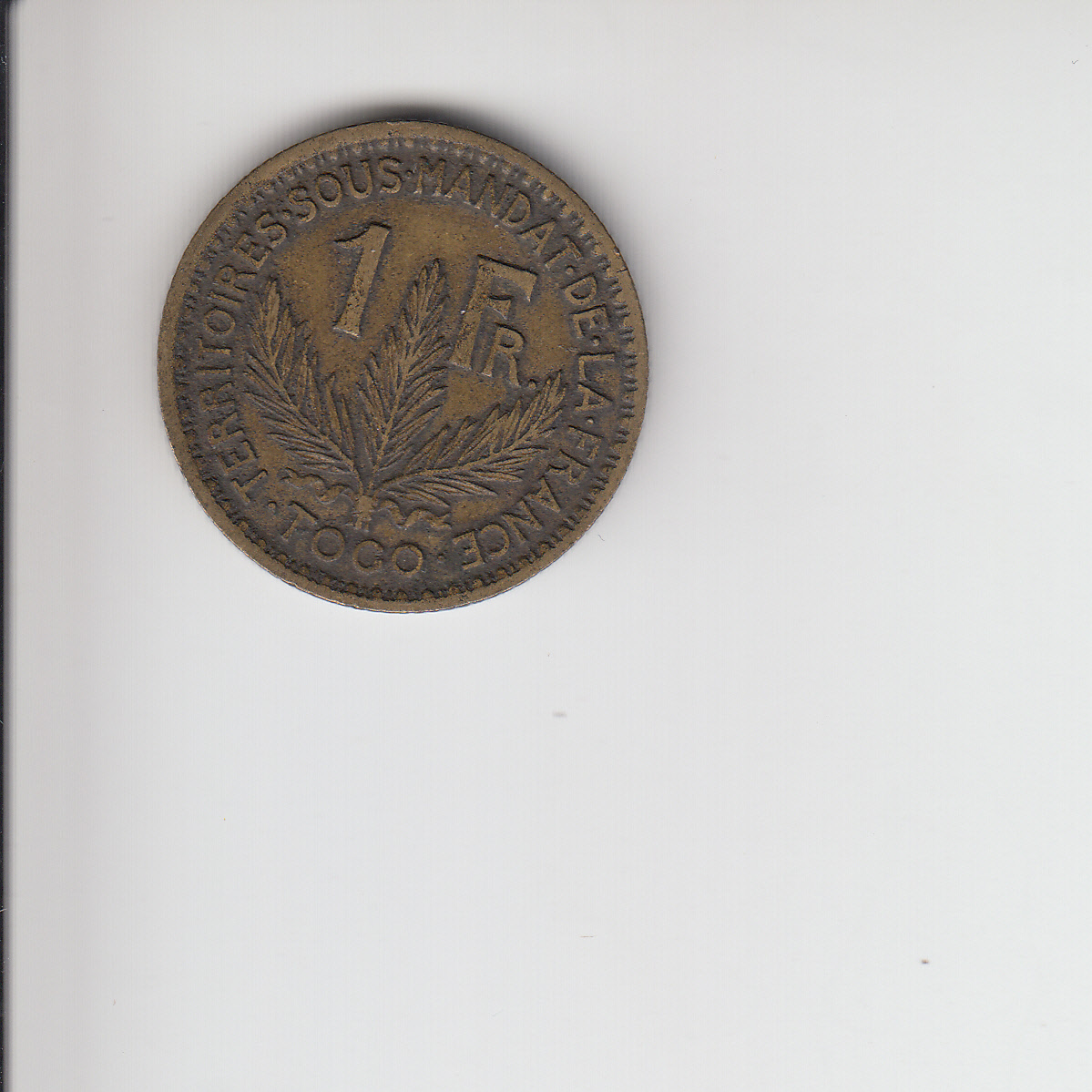
1924 Togo aluminum bronze 1 franc, extra fine: Obverse: Rim with denticles, in a pattern somewhat like an egg and dart motif. Woman’s head with cap and wreath of leaves, facing left. Inscription around rim reads “REPUBLIQUE FRANÇAISE 1924.” Reverse: Same denticle pattern as on obverse. Inscription reads “TERRITOIRES.SOUS.MANDAT.DE.LA.FRANCE.TOGO.” Lettering in middle of design reads “1 Fr.” Three parm branches, tied with ribbon at bottom. Design is shallow, but clear.
Definitely feels very detailed, based on the description I was able to find everything on it, except the lettering of course, because generally I can’t read this letter size with my fingers.
Norway 5 Ore
The next is a 5 Ore from Norway. I don’t have many coins from Norway, especially not older ones, so I wanted this one hoping that I can add a better quality coin to my collection. The description is as follows:
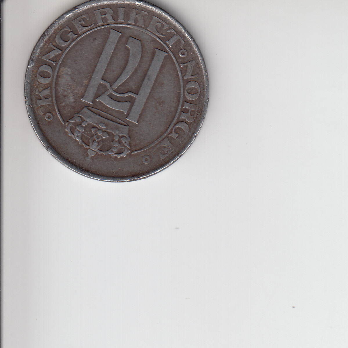
1919 Norway iron 5 ore, very fine, light to medium blemishes: Obverse: raised rim, with inscription: “.KONGERIKET.NORGE.” There is a thin inner ring, with an ornate crown. Below the crown is a large letter H superimposed on a stylized numeral 7. (This is for Haakon VII, king of Norway at the time.) Reverse: raised rim, with largely smooth interior surface. Large numeral 5, with ORE below, and the date of 1919 below that, divided by a crossed pair of axes. Three trefoil shapes are also present. The detail on the coin is shallow, but it is clear, and the weight and feel of iron might be unusual enough to be of interest.
Very nice coin, I can definitely find the details from the description, and the letter H and number 5 is easy to feel. As discussed on this blog previously, it is much easier for me to enjoy larger coins like this one. Definitely a nice addition to my Norwegian collection.
Guernsey 1 Double
The last one is an 1830 1 Double from Guernsey. I recently started to read about the coinage of Guernsey and I already have a few, so there’s nothing like getting the KM #1 from a series. This is the description:
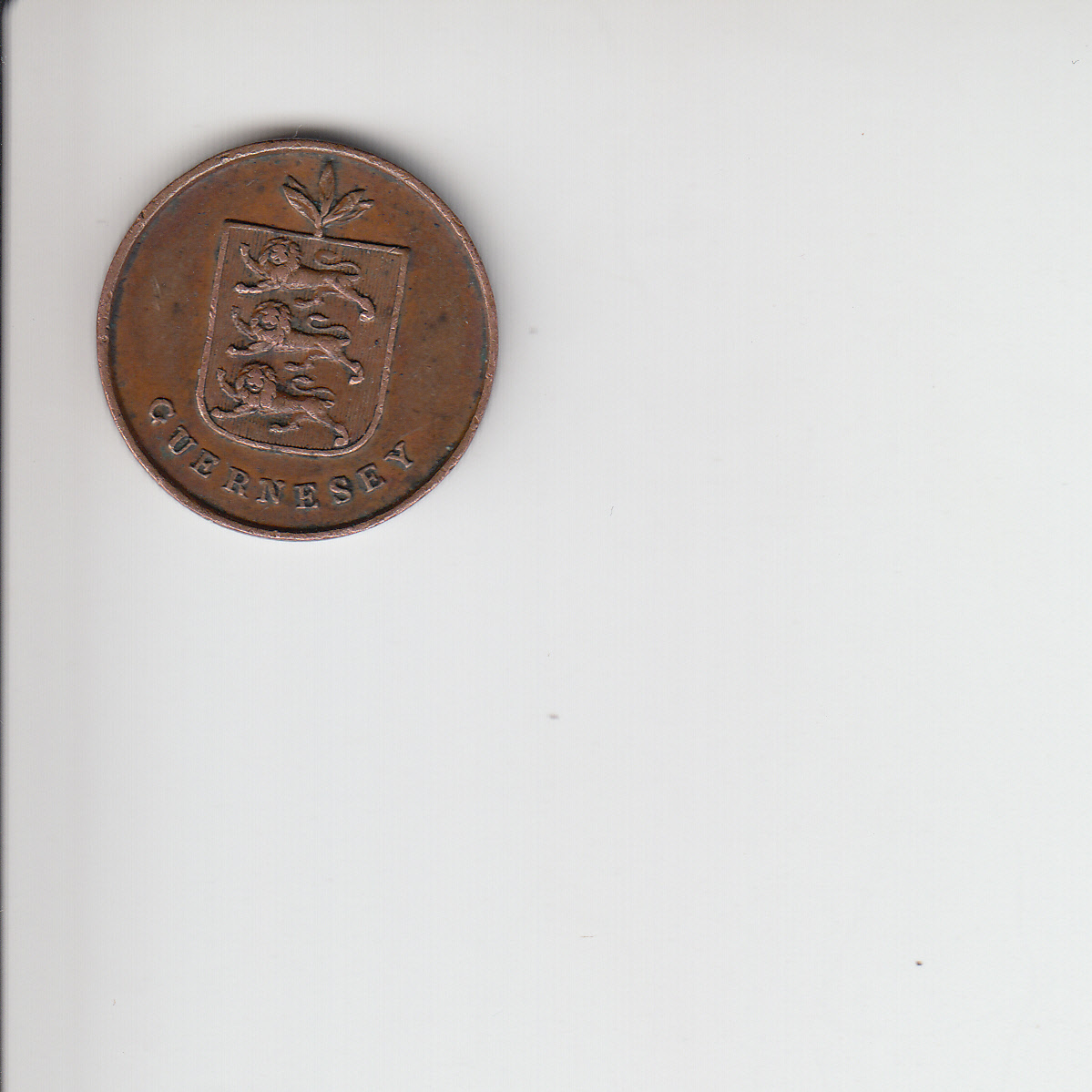
1830 bronze Guernsey 1 double, extra fine. Obverse: raised rim, shield with three lions passant on a lined background. Shield is topped with three leaves. Below the shield is the inscription reading “GUERNSEY.” Reverse: Raised rim. Very plain, only detail is a raised inscription reading “1 DOUBLE 1830” in three lines across the center of the coin. Very clear detail.
Very clear was an understatement. It is an amazing coin, at least for the touch. All the details are very strong and deep, almost unusually compared to the average detail of the rest of my coins. To be honest, from 1830 to have a KM #1, I would have been happy with anything, but I just love this one.
There was another description I particularly liked, but I had to draw the line somewhere:
1666 Sweden copper ? ore: I’m only including this because it’s one of the oldest European coins we have. It’s very, very worn, and I don’t know how much of the detail would be tactile. Most of the detail is very difficult to make out. The reverse has a crown and some heraldic animal, probably a lion, with the denomination on both sides of it. It does have one interesting detail: the coin was mis-struck, so the rim on the reverse is offset.
I have a weakness for older coins in general, but the fact that it could potentially be an old error coin sounded very interesting.
In general, the other descriptions were great too, and I would have probably bought at least 90 percent of the listed coins if I had the budget. I think this is because Elizabeth really put an effort into finding coins based on my suggestions that I would have enjoyed. I hope they still have some of them for next time.
It was a really great experience shopping from this online store. I think from now on, it is my number one recommendation if anybody is asking me about a good store. In case you haven’t done it yet, go check out the store and check out the blog. Absolutely worth it. Also find them on Facebook and on Twitter.


I have been following The Stamp and Coin Place for awhile. I’m not a coin collector, but I love the creativity they put into their content and it always makes interesting reading. It sounds like they put just as much creativity into helping their individual clients. This is awesome!
Absolutely, their content is very informative, and interesting, it is on the top of my favorite blog list.